JP MORGAN PAYMENTS
Visual Toolkit


SITUATION
In 2022, I was a Creative Director leading a pitch team competing against other agencies for JP Morgan Payments' first global brand campaign.
I was challenged with repositioning their centuries-old legacy bank to compete with modern, tech-forward FinTech brands. The brief was focused on selling through a strong brand platform to launch JP Morgan Payments into the future.
TASK
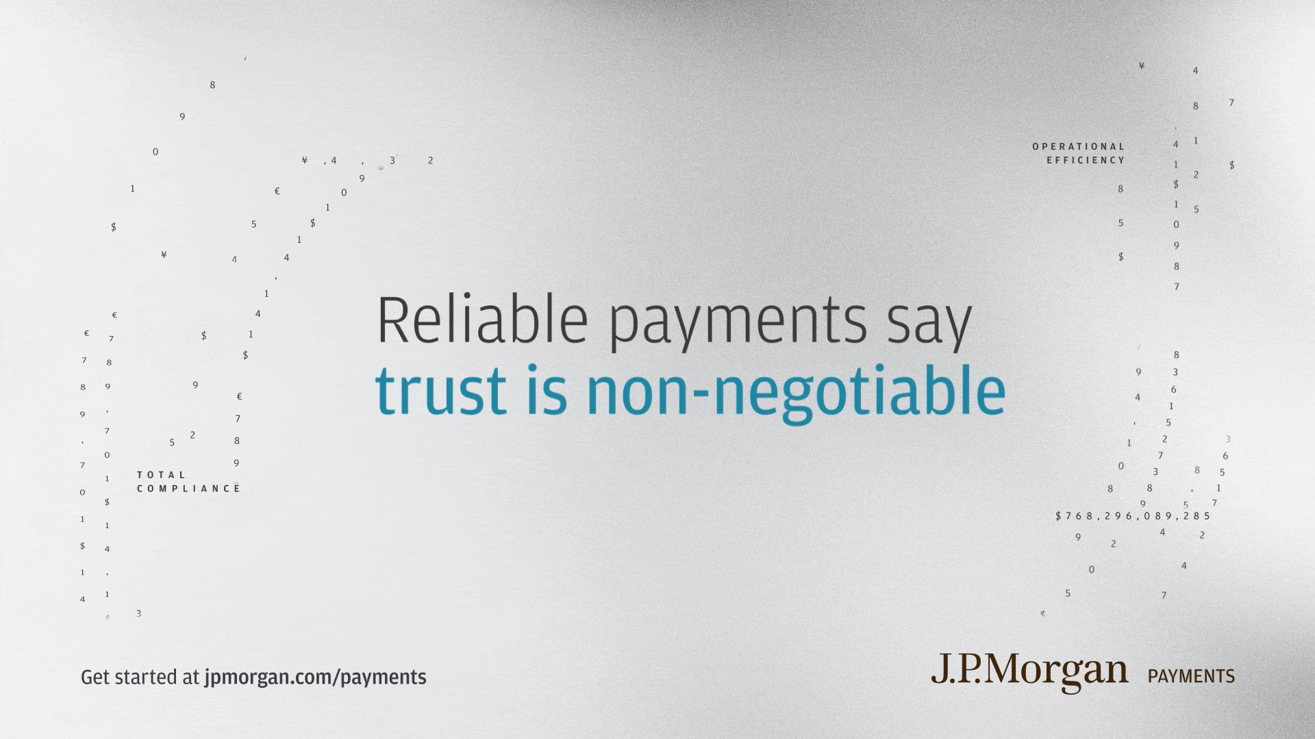
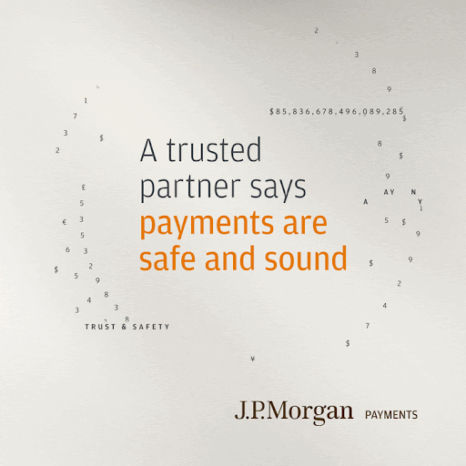
Serving as both the design lead and creative lead—my responsibility was to develop the winning creative platform “Every payment speaks volumes” and ensure we could execute it consistently at global scale.

During the campaign development, I recognized a critical gap:
The client's internal studio team would need to produce ongoing work in this new campaign style while we were simultaneously developing it ourselves.
Without a comprehensive visual system, we'd face endless revisions and inconsistent executions that could dilute the brand transformation.
ACTION
I made the decision to build a complete visual toolkit which included typography rules, color systems, photography style guides, and motion design principles—even though it wasn't in the original scope or budget.
Conceptual thread: Transactions are in constant motion across the world and I intended on making that movement the driving theme of how the platform came to life.
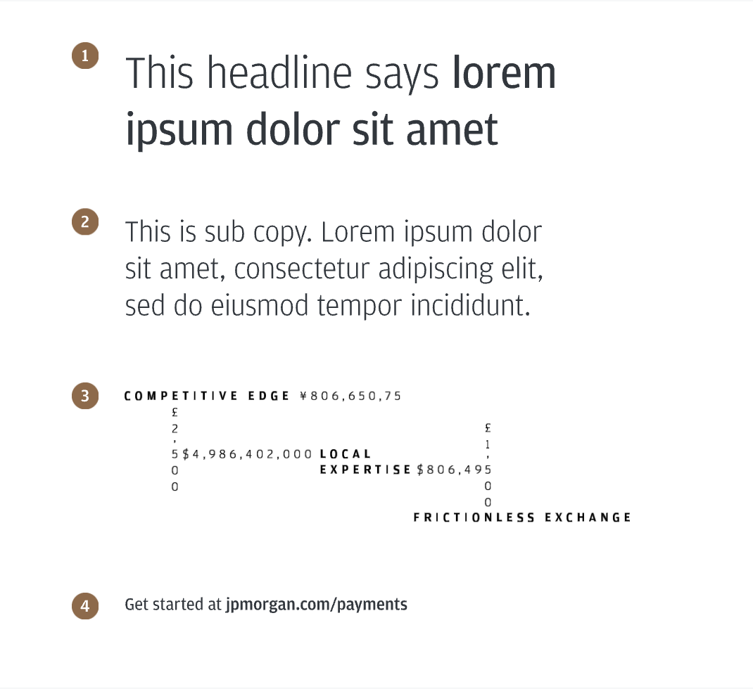
Typography and Design Heirarchy

Color System
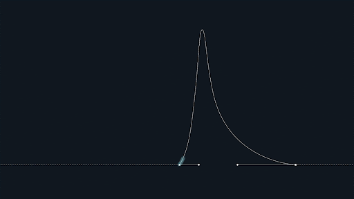
Motion Principles

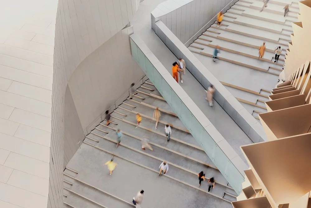
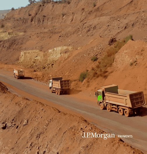
Photography Style:
Moving at the Speed of Payments


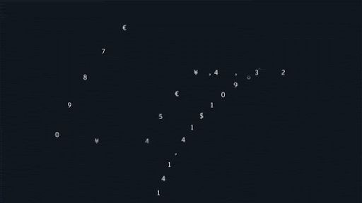
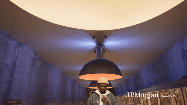
Motion Design Style: Payments in Motion


Iconography

UI Motion Design

When I originally presented the idea of a toolkit to my internal team and the client, I faced immediate resistance about timeline and cost. The client questioned whether we could deliver it in time for their big launch and whether the additional expense was necessary.
I pushed back by reframing it as an investment, not an expense. I explained that without clear guardrails, their internal team would struggle to maintain the elevated aesthetic needed to compete with FinTech brands, and we'd spend more time on design revisions than on innovative ideas.
The toolkit would give us a shared set of rules, templates and guides that both teams could use to create assets quickly and confidently, with minimal friction from leadership. With their buy-in, I secured approval to expand the scope.
RESULT
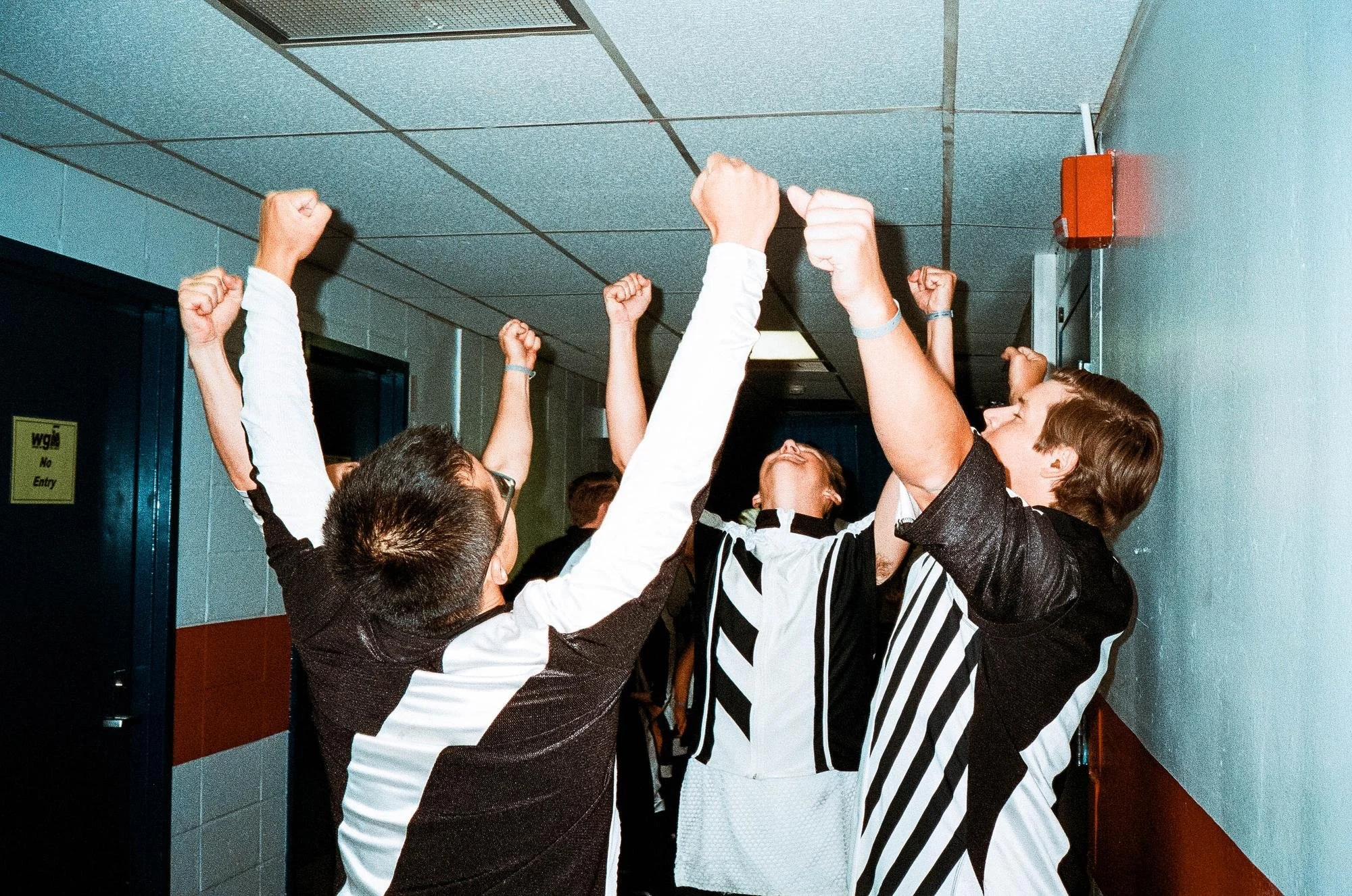
Although we won the pitch, real validation came during execution. The CMO became deeply involved, making special requests constantly: "Can we create video content for this lobby?" "We have a robot with a screen—can you brand that?" Because we had the templated design system in place, my team could rapidly adapt to these executive requests while simultaneously working on other deliverables.
The toolkit enabled us to scale efficiently—we ultimately created over 200 OOH placements across 5 countries in multiple languages. More importantly, the client's internal studio gained the confidence and tools to extend the campaign themselves, which strengthened our partnership and led to continued collaboration on future projects.